-
Google
G SuiteLead UX designer
I was hired to lead the overall user experience of the G Suite website.
view project
OVERVIEW
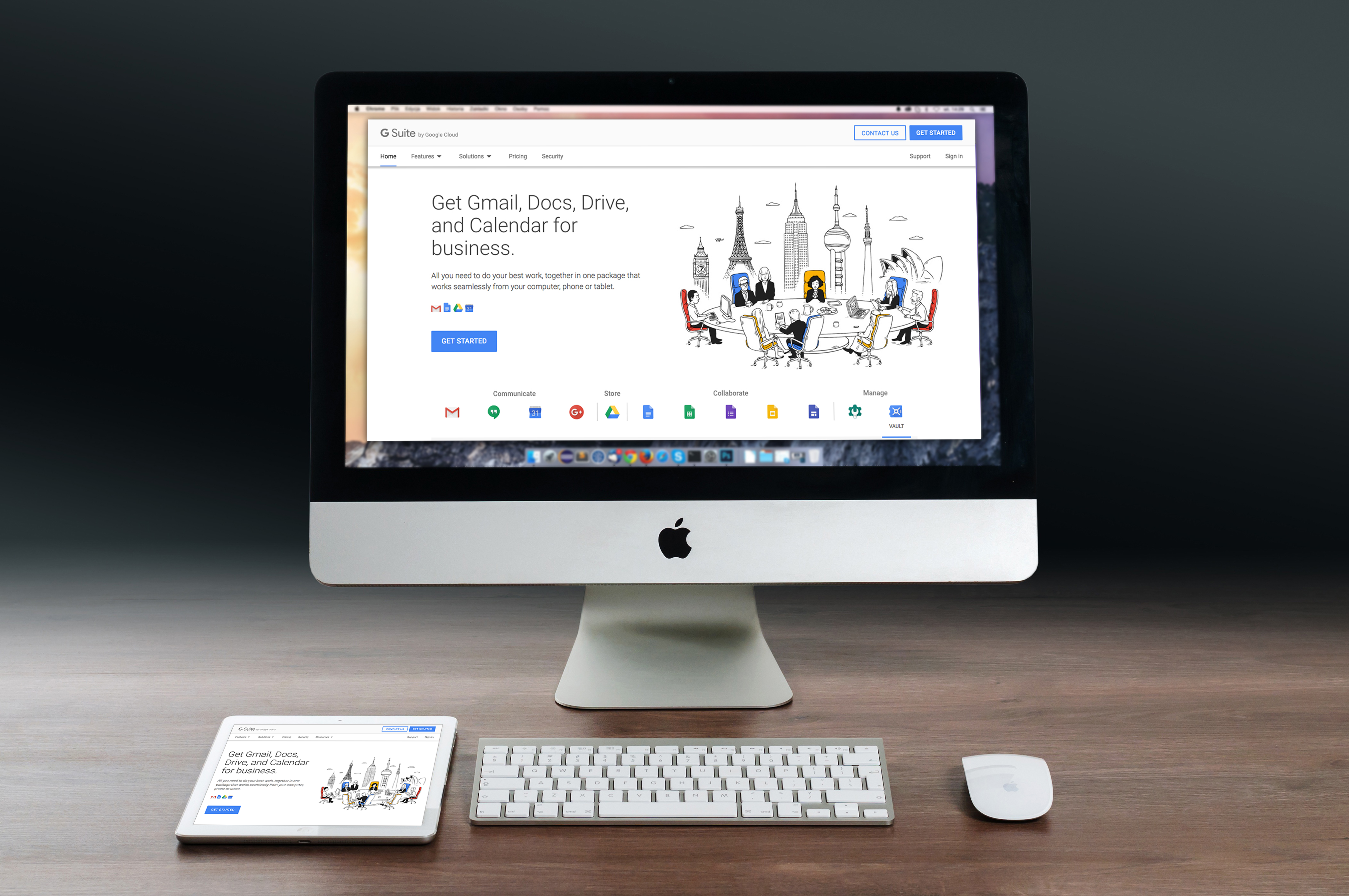
G Suite is a suite of cloud productivity and collaboration tools developed by Google for business. The top used products in the suite are Gmail, Hangouts, Calendar, G+, Drive and Docs.
While these services are free to use for consumers, G Suite adds enterprise features such as custom email addresses at a domain, unlimited cloud storage, administrative tools and advanced settings. This service is ad free and backs all data and information to Google's main data centers.
G Suite has 3 million paying businesses, and 70 million G Suite for Education users.
THE PROBLEM
The main problem with the original G Suite website design was that they didn't clearly explain to the user that this was a suite of products. They simply focused on Gmail for your business. This was driving away many potential customers and leaving large businesses alienated from the start. Other problems were:
•Non responsive
•Huge logo and boring stock photography
•Weak messaging
•Get started would take the users to a form that didn't give them any context of what they would be getting.
•Focuses on email not the entire suite
THE SOLUTION
To create an inviting website that tells a story about what G Suite really is and why we think you should sign up. I wanted to redesign the pages from the homepage down to have a clear paths for different size businesses. The main solutions I wanted to tackle were:
•Restructure information architecture
•Update overall design and story
•Create new pages to focus on business size
•Rethink sign up flow and pricing page
SITE AUDIT
The first step in redesigning the information architecture is to do a site audit on the entire G Suite website. The G Suite site has thousands of pages throughout the entire website. Most of the pages are support pages that we don't manage, so I won't have to worry about those. The main website is made up of about 30 pages, that we can explain the G Suite story. After mapping out all the pages I can see what pages are needed and which pages we can remove.
RESEARCH
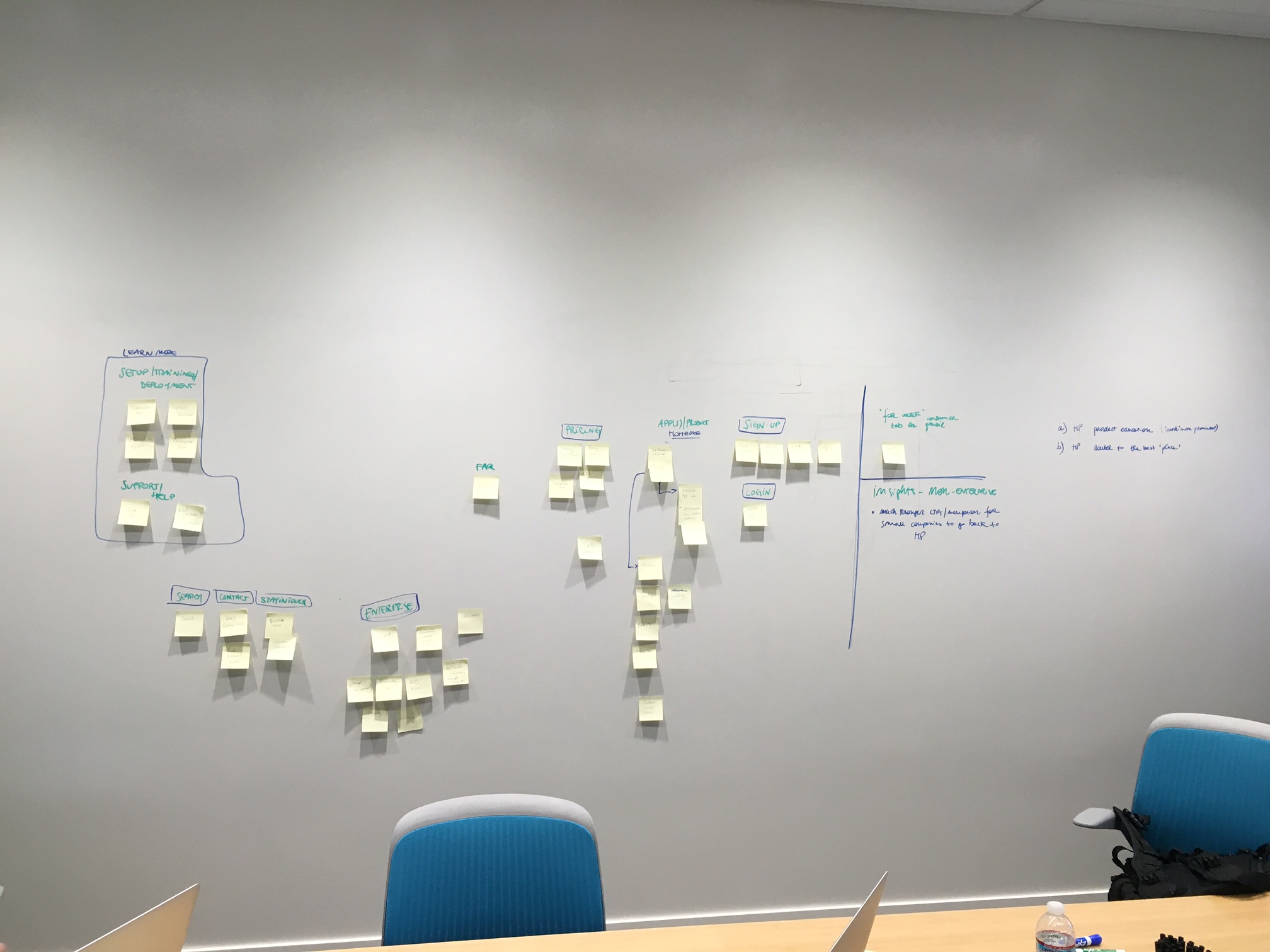
The first research task I wanted to conduct was a card sorting exercise. Card sorting is a method used to help design or evaluate the information architecture of a site. In the session, the participants organized topics into categories that make sense to them and they may also help you label these groups. From these findings we were able to figure out the categories that made sense to bucket all of the information on the website. We ended up landing on Home, Features, Solutions, Pricing and Security.
The second research task was a task completion exercise. This research then informed us what the ideal user path would be to complete certain tasks.
USER ARCHETYPES
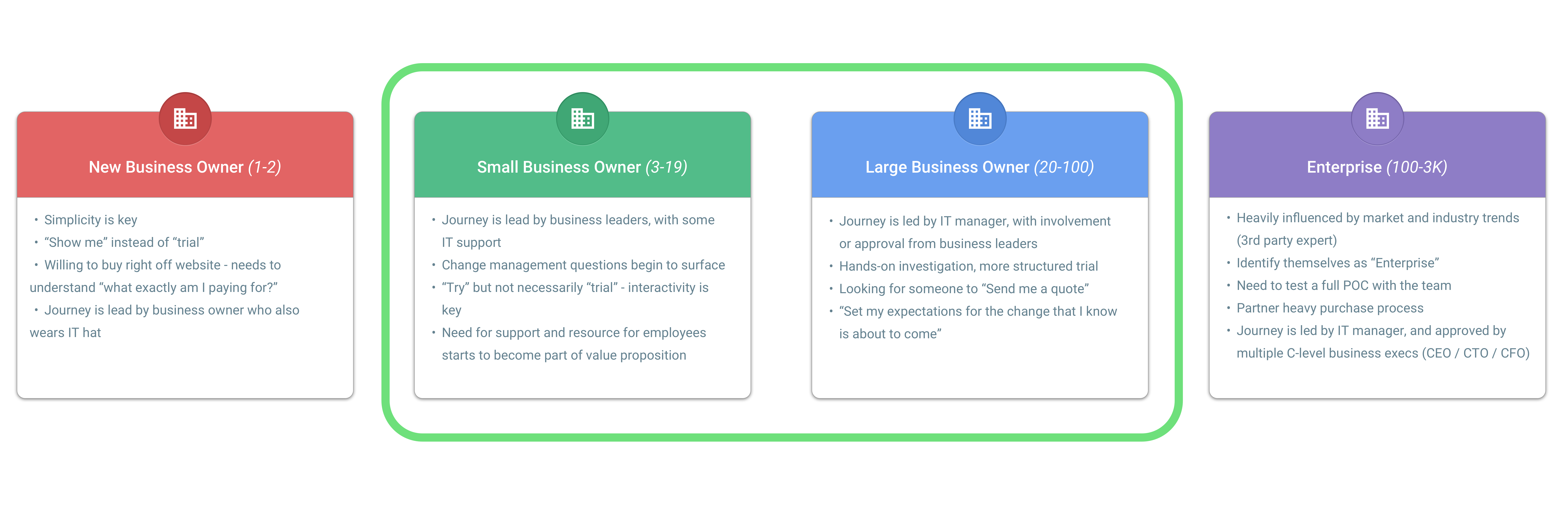
Our users are split into 4 different archetypes: Very Small Business(1-2 employees), Small Business(3-19 employees), Mid sized business(20-100 employees) and Enterprise(100-3,000+ employees). Each of these segments have different overall goals and expectations when trying to sign up for a G Suite plan.
USER ENGAGEMENT

There are multiple points of friction and drop-off across the G Suite web funnel. In 2016, 18.4% of gsuite.google.com traffic initiated signup and 0.9% completed signup.
The goal is to Identify and eliminate or reduce points of friction across marketing site and signup/setup. Use signals to create a tailored, right-for-me signup and setup UX. Create curated solutions pages for new businesses, small businesses, and teams. Seamless UX transition between marketing site and product, including CTAs and lineup. Simplify and streamline current signup and integrate Google Domains. Converge into a unified signup + setup platform and UX that is informed and customized by user signals.
SITE MAP
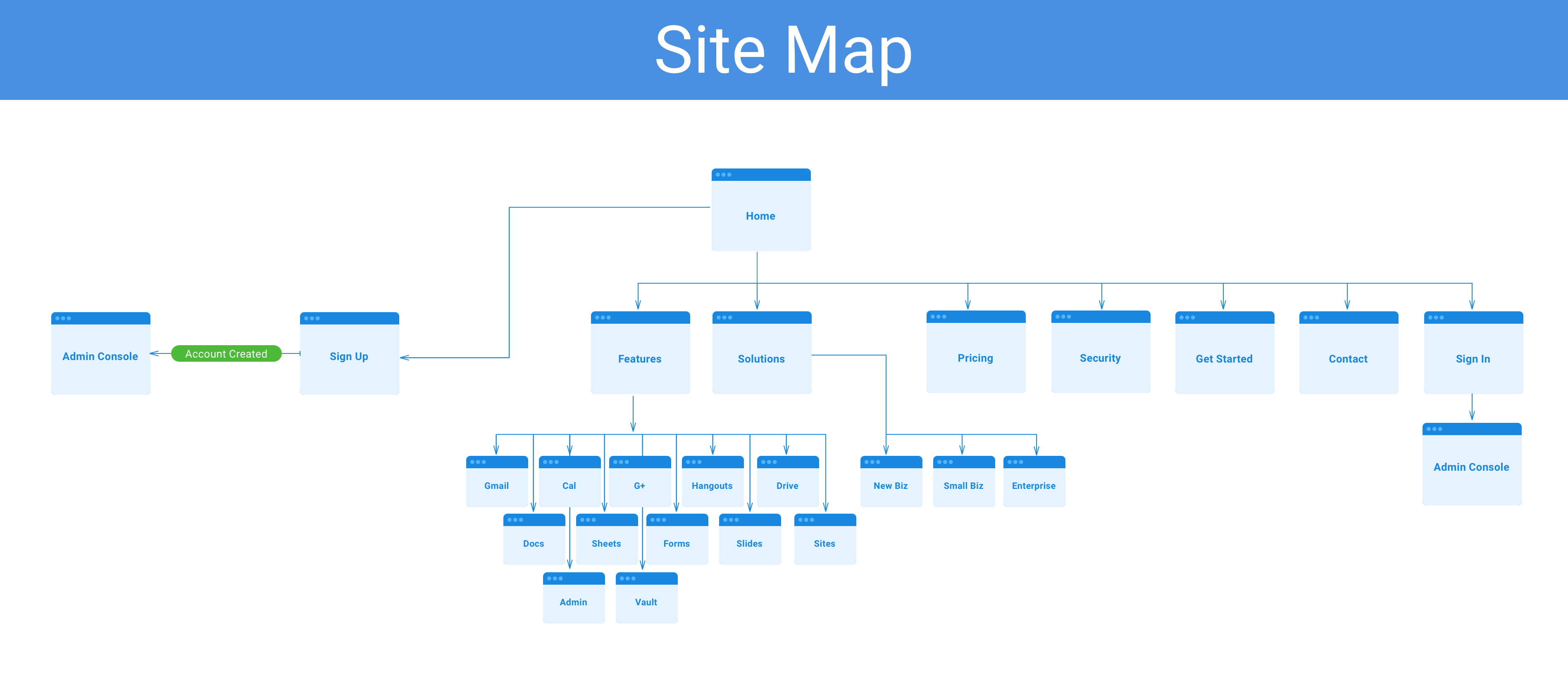
The old site map had far too many links, so I wanted to clean most of those up and focus the user on getting them familiar with the product and eventually signing up for a plan. The final site map we landed on was: Home, Features, Solutions, Pricing, Security, Get Started, Contact and Sign In. Once the user signs up or signs in it will take the to the admin console.
CEO PERSONA
I created a persona for G Suites top user which would be a small to mid sized business. This individual would be in his 40's and is an IT manager that would be searching for new products for his team. His main goal is to find something that is cheaper and more reliable than his current solution. Most likely he is using Microsoft and wants to see what Google is doing. After thoroughly researching the product the IT manager would then contact a sales person to get an estimate on how much the product would be for their team and then he can take that back to his boss and get the okay.
USER JOURNEYS
There are many different user journeys an active user would take depending on the size of the company.
A very small business is typically looking for only Gmail to add their team to since it's a new or small company. They wouldn't need all the products. The typical journey for a very small business would be: search for a business tool, land on G Suite homepage, go to a Gmail product page, look at pricing, sign up and then go to the admin console.
A small business would want Gmail as their main product and possible a few other solutions. The typical journey for a small business would be: search for a business tool, land on G Suite homepage, go to a Gmail product page, get questions answer on the FAQ page, pricing, sign up and go to admin console.
The mid sized business would need more information on cost, security and a few other things before moving forward to talk to a sales person. The typical journey for a mid sized business would be: search for a business tool, land on G Suite homepage, go to specific small business overview page, contact a sales representative, sign up and go to admin console.
An enterprise company would be a large organization that has thousands of employees that will be using this solution. They would need to have months of research and testing before moving the entire team over to a new solution. The typical journey for an enterprise user would be search for a business tool, land on G Suite homepage, get some of their questions answer on the FAQ page, check out security, learn about G Suite's customers and read case studies, contact a sales representative, and eventually sign up. After signing up the team would go to the admin console.
DESIGN CONCEPTS
G Suite's home is a page that explains the suite of products, the main benefits and success stories from current users of the suite. This should give the user a quick understanding of what G Suite is and why they should sign up. If they need more information they can dive deeper into the other pages.
The navigation is a drawer that slides in from the right side of the screen. We strip some of the navigation links out of the mobile nav to focus the user on the main pages. There is also two call to actions to drive users to either contact or sign up.
The features page breaks down what are the main features the user will get if they sign up for the suite.
We created individual pages for different sized businesses so we could relate to what exactly they are looking for. The page that I'm showcasing is the small business page. This page will break down the benefits of using G Suite for small businesses and show them the pricing break down.
If users have questions we will drive them to call a sales representative or fill out the form and someone will get back to them shortly.
Home
Features
Small Business

Pricing
Contact

User Flow
This prototype shows one use case of a typical flow to sign up. The user would land on the home page, do some research to learn about the product, dive deeper into the top features, learn about pricing and then sign up for a free trial.